Bowtiful Packaging
So I’ve wanted to write a little segment on the packaging we use here at Bowtiful, and the history/thought process behind it for a little while now. I think packaging design is fantastically important for any product. The whole design process behind it, that leads up to the final (or current) design can be almost as interesting as the ultimate result.
When designing packaging for Bowtiful, I tried to approach it as systematically as possible. But firstly, what’s the point of packaging? Why does it exist?
- To protect the product, both in a retail environment and when being shipped
- To present the product in an appealing fashion
- To provide information about the product
- To allow the product to be easily displayed/stacked/shipped
Given these 4 attributes of packaging, I wanted to come up with a couple different designs and evaluate each design’s suitability against them. I had some rough ideas in my head for packaging ideas so I sketched a bunch of them out and ended up with a 3 distinct concepts:
- The box
- The wrap around, and
- The sleeve
It’s hard to visualise these things without pictures, but I’ll do my best to explain. The box is just that, a box. Simple, and fairly run of the mill. The wrap around is a rather minimalistic attempt at packaging, it’s a small label like tag that wraps around the centre of the tie. And the sleeve is like a little flatpack/collapsible box. Not quite 2D, but as close as possible while still being able to fit a tie into it.
Looking at the box first of all, it’s not the smallest way of packaging or sending a tie ever, and since postal costs here take into account the thickness of an item, it’s not ideal. It’s also not that easy or quick to make. We were considering making all of the packaging we use in house, so it’s important that it is both simple, cheap and quick to make. Furthermore, the box is a little run of the mill. Everyone, including your grandma, uses boxes. Shoes come in boxes. Pizza comes in boxes. We’re more exciting than that. On the upside however, using the box design provides pretty good protection of the product and it has lots of surfaces with which to advertise/explain/have descriptions on.
With the wrap around tag, the main pluses were that it would be super easy and cheap to make. It would also be mighty light (and thin) for posting. On the downside though, there’s essentially no protection at all, there’s not really enough space for writing/labelling on, and, like the box, it’s painfully de facto.
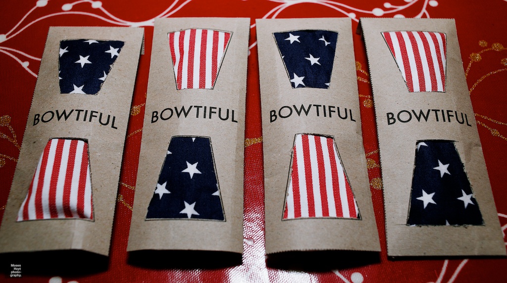
So that leaves us with the flat-pack sleeve packaging. And you can guess which one we went with by now huh? It’s innovative, and looks nothing like anything else out there. I had the great idea of having cut out sections on the front of the packaging so that you could see what tie was inside, and how great it looks. It wouldn’t be too hard to design. Due to it’s more flat-pack/2D nature, it would be far easier to make than a box, though not quite as easy as the wrap around tag. It used a fairly small amount of card, and an efficient use of card at that, so it would be fairly cheap to produce and mail. As the tie would be completely enclosed, it would be protected pretty well from the elements/postal service/etc. but, with the cut out ‘windows’, would still allow the tie to be showcased.
As you may imagine, I went with the sleeve. It just seemed cooler, more suited to the task of packaging a bow tie (not an easy task…), and totally different. When you’ve got a tagline of tie something new you’ve got to try something new with the packaging. So the next step was a lot of concept refinement. There were a bunch of sketches involved, and even some wonderful prototypes. Once the general layout of the sleeve had been determined, it was designed in 2D (flatpack) form so that it could be prototyped and specific parts of the design (like the size of the window, the width of the flaps etc.) tested. This was done a couple times. But the results looked something like this:
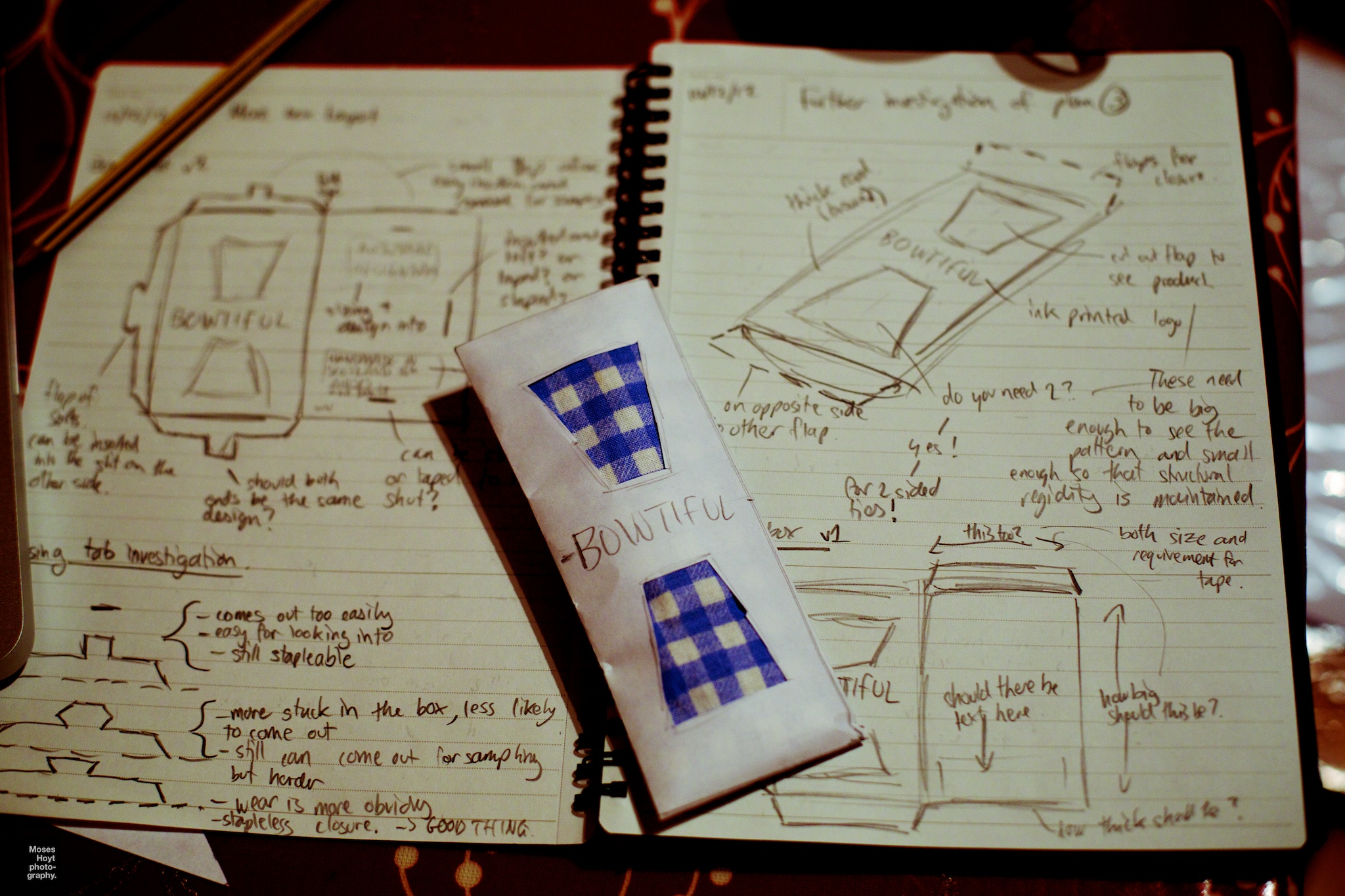
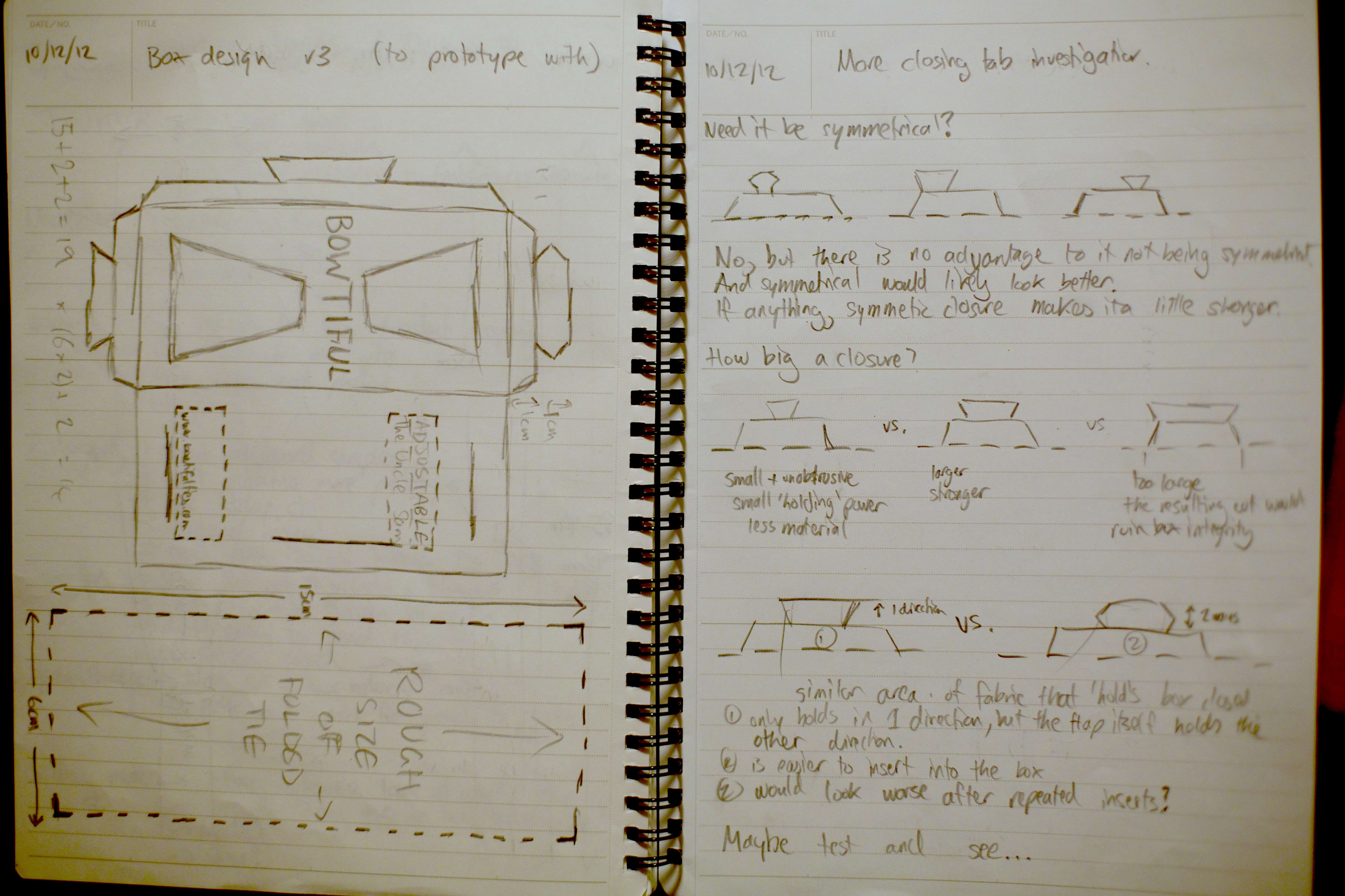
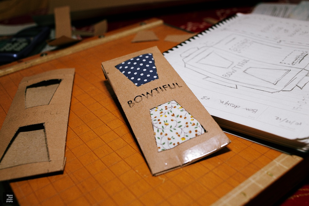
It’s made out of paper, and wonderfully simple, but it showcases the concept (and the tie inside) pretty well. One of the next steps that I focussed on was designing the flaps/closing tabs. What shape should they be? Should they be symmetrical? How big a closure should there be? These were all pretty serious questions. But I feel a photo of the page from my notebook below details this well. You can also see the prototype design that resulted from this little investigation too.
I then set about deciding what should be on the box. What needed to be there? I didn’t want it particularly cluttered, but then again I didn’t want it looking empty either. Overall, I felt the box should be something to convey the overall direction and voice of the brand. I wanted it simple, classy, but with a little tongue-in-cheek attitude to it. For the front, I just settled upon having Bowtiful written in large black Futura. On the back I had Bowtiful in smaller Futura, with tie something new under it, and then bowtifulties.com under that. At the top, there would be the name of the tie, and a little on where it was made. Once again in Futura. And with this I made yet another cardboard prototype.
It was looking better. But I still needed to find a some sustainably sourced card (say that 5 times fast) to make the packaging out of. At the outset of the design, I anticipated buying in the card, getting something thick-but-not-too-thick with just the right amount of recycled content (100%), but I felt I could do one better. We had a lot of packing material left around here at Bowtiful HQ, and while a lot of it is the awful polystyrene kind, some of it is thick paper, crumpled or rolled up and used to protect various Amazon or other orders where the shipping box was much larger than the actual product. I figured that I could try and use these to make some sweet packaging. A fair amount of ironing later (yup, I ironed paper), and some time with a guillotine and a printer, I had some mean lookin’ tie packaging. And 100% upcycled tie packaging at that. Upcycling, is the process of using essentially waste materials and converting them into products or materials of greater environmental value. Ultimately it’s like moving a product up the waste chain, and is far better (both economically and environmentally) than recycling (at least until the point where recycling’s efficiency is far far greater, or until infinitely recyclable materials are developed (à la Cradle to Cradle)).
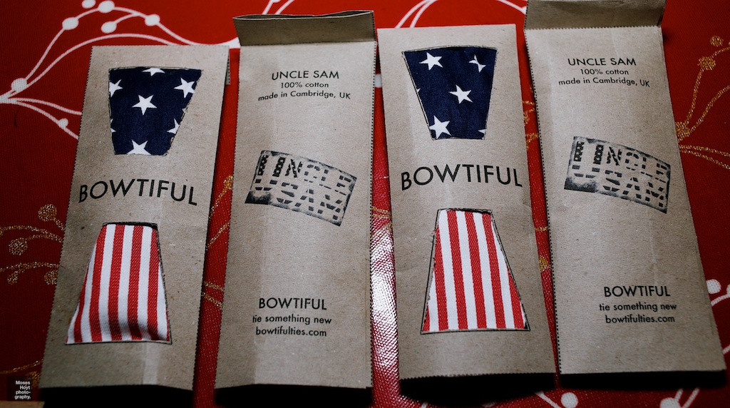
Anyway, the end result is that we have some pretty legit packaging. It showcases and protects our ties well, is cheap to make, has very little environmental cost, and allows them to be shipped around the world as cheaply as possible. And it’s a little different from everyone else’s. We’d hate to blend in.